I’ve been curious about how South Korea flattedned the curve:
I’m pretty sure you had the same thought on how is China with a popuplation of over one Billion had less cases and less fatalities. While I’m not health expert, I can at least analyze the data and give non technical reader an easy way to see how the US did when comapred to other countries. With that being said its near impossible to have the accurate data to analyze. From countries missreporting their fatalities to amplitude of the cases world wide. Due to the nature of the virus it self. its hard to know who’s infected and who’s not since there has been so many cases of peopel carrying the virus but not showing any sympthoms.
Visuals to help see how this virus recked the world.
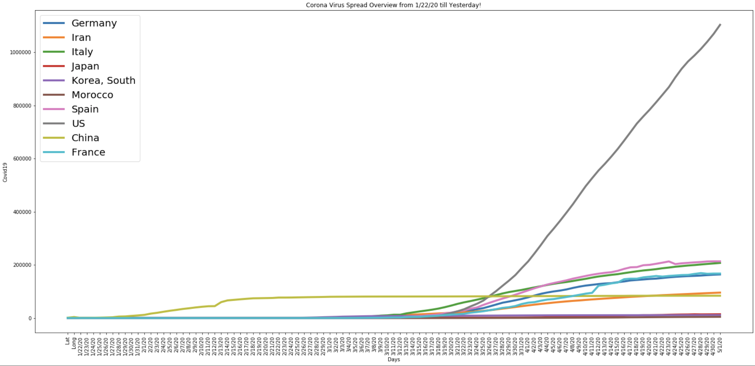
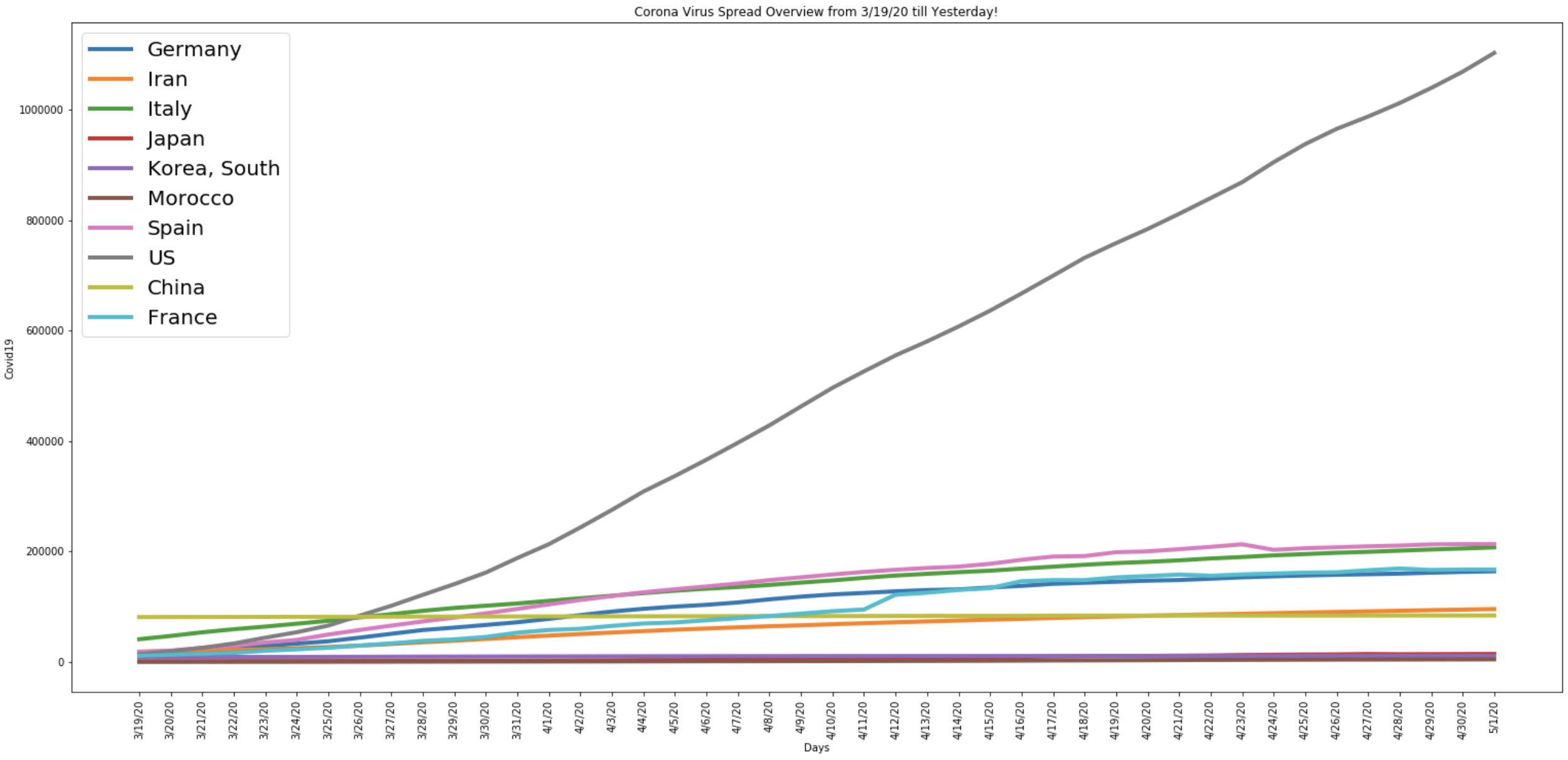
I’m using data from Johns Hopkins to create this graphs to show case how and when the US become the epicenter of the pandemic.
 A simple sad graph showcasing from day one of this tragedy until May first!
 30 Countries where we’ve seen the most cases.
Predictive Model at 87%
Stay home and be safe.
 From 3/19/20 to 5/1/20
Sources: Johns Hopkins